|
In this step, we had to create nine variations of the 3 logos that we chose(3 per each logo). To do this, I changed the design of the cups, color, and fonts. While I was doing this, it was hard to make the handles of the cups completely smooth without any sharp turns. My favorite part was when I was making the tiny tea leaves for the "i". The gradation process was satisfying especially when I was moving the starting point of the gradation. While I was making this, I was able to realize how probably most of the common logos today had to go through the same steps and was the result of multiple changes. 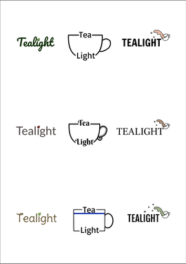 My brand is called "Tealight" and I chose to make a logo for this because I drink tea a lot. Tealight is a brand where it sells multiple types of tea(Ex. oolong, matcha/green, white, puree, etc.) with other tools for making tea. It helps people who also enjoy drinking tea be able to make better "fancier" versions for themselves at home. The teacup's content's color(in the logo) shows how there are also other types of teas that aren't the standard brown or green we think there are. This logo was my favorite because the found was easy to read/see and the teacup was iconic compared to the other two types. Also, in this logo, the tea's opacity is not at 100%, so if you look closely, you can see the cup itself similar to how real tea is transparent. 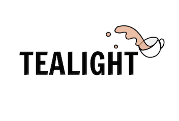
0 Comments
Leave a Reply. |
Archives
April 2019
Categories
All
 This work is licensed under a Creative Commons Attribution-NonCommercial-NoDerivatives 4.0 International License. |
