|
In this assignment, we had to look and create palettes for the 4 color schemes: -Monochromatic: one hue with various saturations and brightness levels -Analogous: hues that are next to each other on the color wheel -Complementary: combines hues from opposite sides of the color wheel -Triad: combines 3 hues evenly spaced around on the color wheel We chose our colors for these schemes by using Adobe Color. My favorite out of these 4 color schemes is analogous since you can easily change and see multiple color choices. For example, you can make different colors in the category of blue colors, or make a combination of multiple different colors(Ex. rainbow). To make the project below, I used a pen tool to make the clouds and raindrops. This was the hardest part because I had to make the cloud shape naturals and make sure that the smaller bumps don't look too combined. The rest of the process was easy since I just had to change the colors of the raindrops by using the HEX codes. For final details, I copied and pasted the clouds and changed their sizes and colors. Here is the project below. 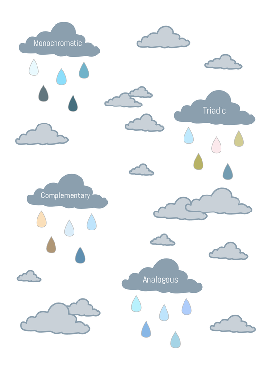
0 Comments
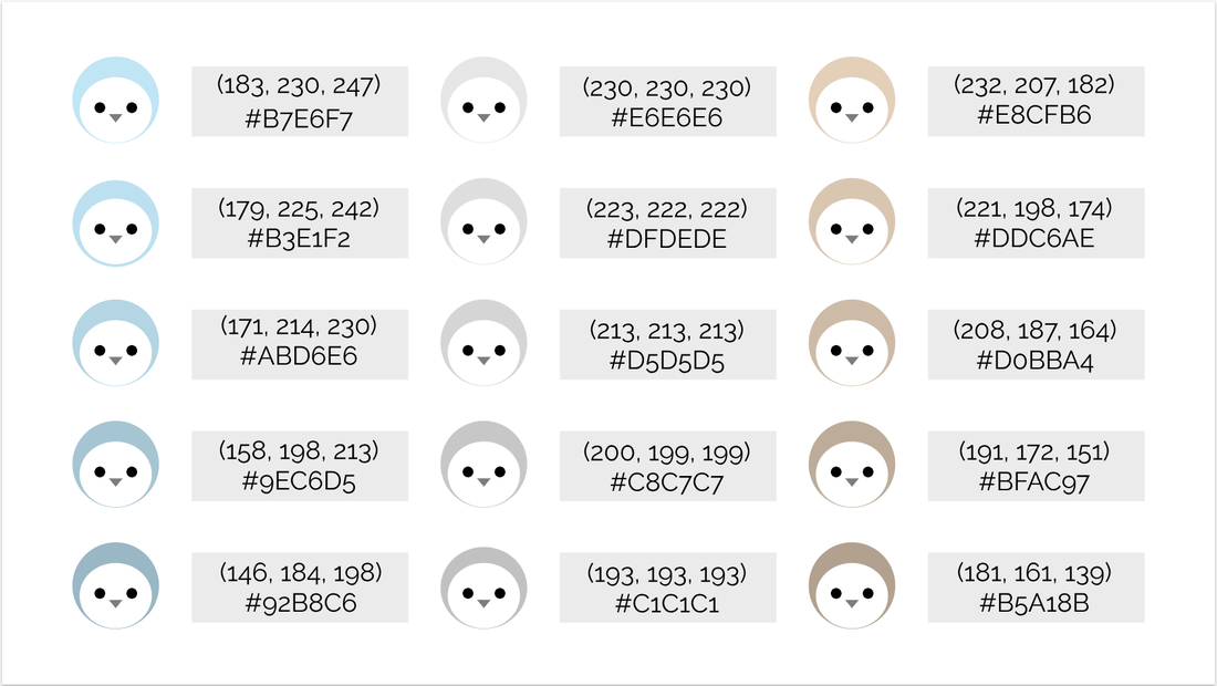 In this assignment, we had to create a simple artwork and make 15 copies of it with different colors. First, I made a penguin by using simple shapes(circles and a triangle). To make it, I overlapped two circles(one was bigger than the other) and made sure that they were centered by using the align center tool. Then I added the eyes by making two black circles and added a gray triangle for its mouth. After I made 15 copies of the penguins, I changed its feather colors to 15 different shades. As you can see above, I chose blue, gray, and tan and made the values get darker. Then I made the boxes for the text and put the text boxes over them. Finally, I found the RGB values and the HEX code for each color and typed them down in the boxes. While I was making this, making the alignment for the gray boxes was hard because the penguins were circles. So I had to make two smaller boxes(identical in size) and put them on each side of the boxes and see if the ends didn't go over the penguin's guides. This worked out well and the final result looked organized and aligned.
What is typography?Typography is a composition and expression such as typeface and letter arrangement of type in design. It includes contrast, repetition, alignment, and proximity. Typography is important because it can change how the person takes a message and how easy it is for them to read. There are 5 main types of fonts, serif, sans serif, monospaced, script/handwritten, and novelty. Serif fonts have feet/hands on them, sans serif are like serif fonts but they lack the feet/hands, monospaced's letters have equal width, script/handwritten looks like they were written by someone, and novelty are fonts that have "special effects". This is where the phrase "Each font has personality and a purpose" comes in. For example, handwritten fonts would feel for old/handmade and would not be suitable for business logos(You would probably use Serif or Sans Serif). Below are two examples of typography. Typeface comparisonIn this project we had to find a font for each 5 types of font(Serif, Sans Serif, Monospaced, Handwritten/Script, and Novelty). To do this we went on Gravit to find fonts for each type that were from the system. The we used the C.R.A.P. design principals to create the project below. 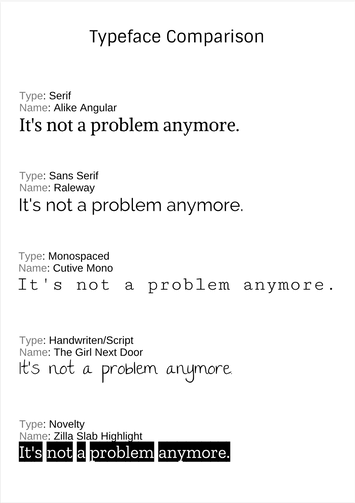 Word portraitsFor word portraits, we had to choose 10 fonts and write two words for each font, one that matches the font and the other that doesn't. For example, I wrote Earl Gray for the font that matches and Lego for the one that doesn't for a handwritten font. When we chose all the fonts and words we used the C.R.A.P. design principals to finish the project. 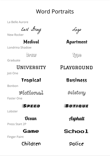 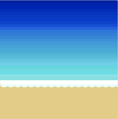 In this lesson, we used a Khan Academy Java Script lesson to learn how to make simple shapes, how to color, and adjust the borders of shapes and backgrounds using Java Script. A few examples of simple shapes that we learned to make are ellipse, rectangle, triangle, arcs, and much more. To make the artwork above, which is a beach, I had to create the ocean itself, the foam made by the waves, and the sand. First, I changed the background to the color of the sand for the base. Then I made multiple rectangles that transitioned from navy blue to a lighter greenish blue for the ocean. Finally, I added two rows of arcs(one in white and other in baby blue) to represent the sea foam. Below is the code I used to create this image. The code:
noStroke(); background(230, 204, 124); // sand fill(0, 22, 168); rect(0,0,400,10); //OCEAN 1 fill(2, 26, 179); rect(0,10,400,10); //OCEAN 2 fill(0, 25, 189); rect(0,20,400,10); //OCEAN 1 fill(0, 38, 189); rect(0,30,400,10); //OCEAN 1 fill(0, 46, 199); rect(0,40,400,10); //OCEAN 1 fill(0, 50, 199); rect(0,50,400,10); //OCEAN 1 fill(0, 50, 209); rect(0,60,400,10); //OCEAN 1 fill(0, 59, 209); rect(0,70,400,10); //OCEAN 1 fill(0, 73, 219); rect(0,80,400,10); //OCEAN 1 fill(9, 96, 227); rect(0,90,400,10); //OCEAN 1 fill(0, 116, 224); rect(0,100,400,10); //OCEAN 1 fill(0, 125, 219); rect(0,110,400,10); //OCEAN 1 fill(0, 133, 219); rect(0,120,400,10); //OCEAN 1 fill(0, 144, 222); rect(0,130,400,10); //OCEAN 1 fill(7, 155, 219); rect(0,140,400,10); //OCEAN 1 fill(0, 163, 219); rect(0,150,400,10); //OCEAN 1 fill(0, 170, 219); rect(0,160,400,10); //OCEAN 1 fill(0, 173, 219); rect(0,170,400,10); //OCEAN 1 fill(26, 185, 217); rect(0,180,400,10); //OCEAN 1 fill(42, 192, 222); rect(0,190,400,10); //OCEAN 1 fill(55, 201, 230); rect(0,200,400,10); //OCEAN 1 fill(76, 208, 235); rect(0,210,400,10); //OCEAN 1 fill(27, 217, 224); rect(0,220,400,10); //OCEAN 1 fill(63, 219, 227); rect(0,230,400,10); //OCEAN 1 fill(41, 224, 230); rect(0,240,400,10); //OCEAN 1 fill(106, 228, 232); rect(0,250,400,10); //OCEAN 1 fill(107, 223, 227); rect(0,260,400,10); //OCEAN 1 fill(255, 255, 255); rect(0,270,400,10); //OCEAN 1 arc(14,279,27,18, -8,194); arc(37,279,27,18, -8,194); arc(60,279,27,18, -8,194); arc(83,279,27,18, -8,194); arc(106,279,27,18, -8,194); arc(129,279,27,18, -8,194); arc(152,279,27,18, -8,194); arc(175,279,27,18, -8,194); arc(198,279,27,18, -8,194); arc(221,279,27,18, -8,194); arc(244,279,27,18, -8,194); arc(267,279,27,18, -8,194); arc(290,279,27,18, -8,194); arc(313,279,27,18, -8,194); arc(336,279,27,18, -8,194); arc(359,279,27,18, -8,194); arc(382,279,27,18, -8,194); arc(405,279,27,18, -8,194); fill(227, 255, 250); arc(14,285,27,18, -8,194); arc(37,285,27,18, -8,194); arc(60,285,27,18, -8,194); arc(83,285,27,18, -8,194); arc(106,285,27,18, -8,194); arc(129,285,27,18, -8,194); arc(152,285,27,18, -8,194); arc(175,285,27,18, -8,194); arc(198,285,27,18, -8,194); arc(221,285,27,18, -8,194); arc(244,285,27,18, -8,194); arc(267,285,27,18, -8,194); arc(290,285,27,18, -8,194); arc(313,285,27,18, -8,194); arc(336,285,27,18, -8,194); arc(359,285,27,18, -8,194); arc(382,285,27,18, -8,194); arc(405,285,27,18, -8,194); In this project we had to create a complex design of something that is important/meaningful to you by using multiple basic shapes we learned(are in previous posts). For this project, I chose my dog Browny because he was my first actual pet(not counting fish) and helped me feel less lonely as an only child. He also helps our house feel less lonely when he come in by running and barking towards us to greet us. Browny means a lot to me and my family in many other different ways and we are thankful that we were able to have him be a part of our family. To create this picture below, I had to mostly convert rectangles and eclipses to paths and change its shapes. To put together the shapes, I used a picture of Browny as a guide and layered the shapes above the picture. For the colors, I used the tool for finding the color on the canvas and used it to make sure Browny had the most similar colors to real life as possible. The hardest part overall was the nose because I had to create almost 25 different shapes to get the shape of his nose. But in the end I was able to put the shapes together and created the picture below. 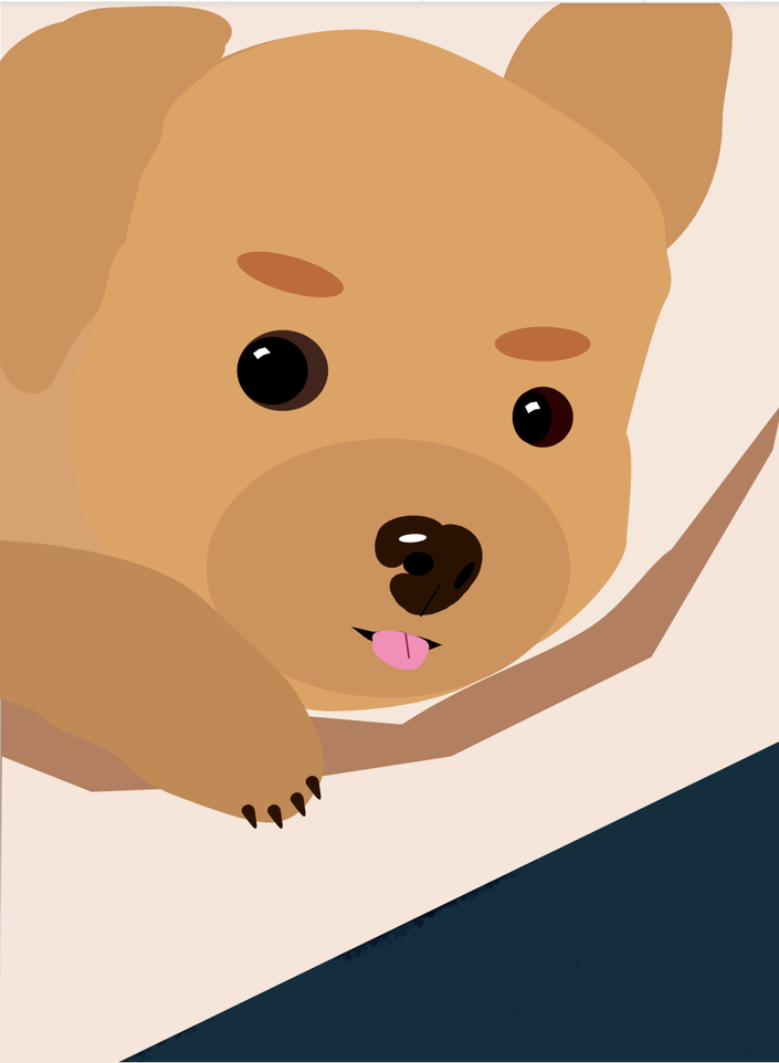 In this lesson, I learned how to make and edit different kinds of shapes. To change the sharpness of the corner of the shape, you can use the slide labeled corners to change it. For other shapes that are not a square, you can change the amount of points there are in the shape by using the points slide. If you would want to change shapes that are overlapping each other you would first have to select both shapes. To make the two or more shapes into one shape, you would have to choose the union button. To get rid of everything in the area of one shape(including the overlapping part), you can use the subtract tool. For only leaving out/subtracting the part where the two or more shapes intersect, you can use the intersect/difference button. You can find all these tools in button that has 2 overlapping squares in the tool bar. Here is a picture of my work. 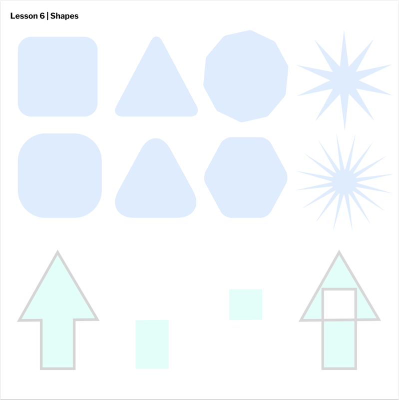 In this lesson, we learned how to layer, group, and align different shapes on Gravit. To do this, you would have to use the alignment tools on the right sidebar, the layers on the left sidebar, and double clicking on the object. To group a set of shapes, you can double click(after selecting all the shapes) and click make a group or simply press command+G. To ungroup, you can double click and select ungroup. When you want to align your shapes, you can use the alignment tools on the right sidebar to align the shapes you want them. A tip you can use when aligning manually is to use the blue lines that appear when you align objects. Finally, to layer the objects, you can either use the keyboard shortcut after selecting the shape/s or move the layers at the sidebar on the left side of your screen. To move the shape all the way down, you would use command+shift+down, and to move it only one layer down, you would only use command+down. It is the same for moving your shape up only with up keys. Here is my work for this lesson. 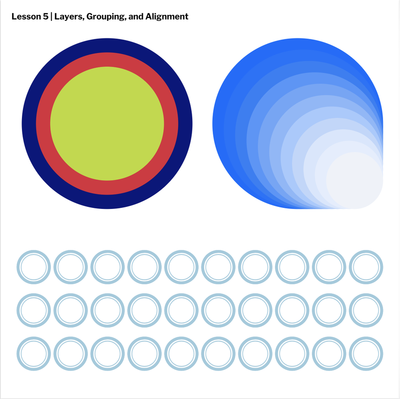 In this lesson, I learned how to adjust the fill and borders of shapes. To do all of this you would have to use the fill and border options on the bar at the right side of your screen. To change your border thickness, you can change the amount of pixels the border would be. To make the border be at a different side of the shape, you would have to go into advanced settings and change the setting to align to inside/outside(center is default). You can also change your border into a dashed line(you can choose the gap and dash length) and the corners of the border. If you would want to change your fill transparency, you can change the opacity using the line or typing your opacity percent in. Also, if your color's background is a checkered background, it means that your shape's opacity isn't a 100%. Here is an example. 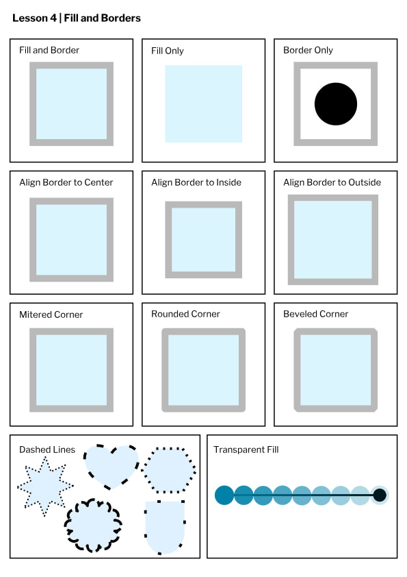 In this lesson about Gravit, we learned how to make simple shapes such as circles and squares on Gravit. To make a shape, you would first have to select the shape making tool and select which shape/line you want to create. After you chose your shape, you can modify it any way you want by changing its color, size, or the border on the bar on the right side of the screen. To change your shape into a more "free" shape, you can change your shape into a path and change the shape. To make your final work into a document, you would have to export your work as a JPEG and as a retina display for it to have a high quality. Here is a picture of my work. 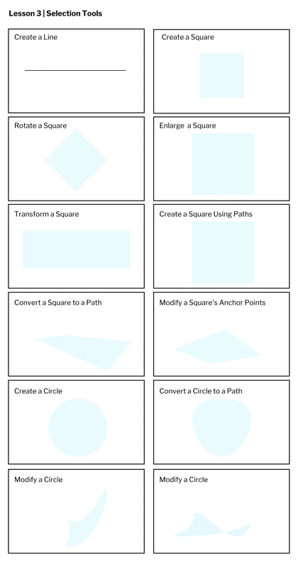 In this project, I was able to learn how to sign up for Gravit and how to use Gravit. Gravit is a site where you can make vector images which are images that are made out of simple mathematical shapes. To sign up for Gravit, you just have to use you gmail account and sign up for free. After you sign up, you just have to click create new and start your project. In this project, I made simple boxes with different sizes, units, and colors. First, to make a box, you would have to simply choose your unit(pixels, millimeters, etc.) and type in your desired size. Second, I chose the color by clicking on the color circle and choosing the color. Third, you can add the text and change the font and color by clicking on the text box. Then you simply repeat the steps by clicking on the add page button(I did this 4 times). Finally to see all your pages in 1 screen, you would have to click on the multipage button. Here is a picture of my work on Gravit. 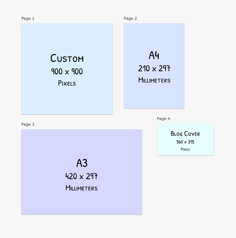 |
Archives
April 2019
Categories
All
 This work is licensed under a Creative Commons Attribution-NonCommercial-NoDerivatives 4.0 International License. |
