|
For this mission, we had to include links that would lead to another website when you click it. A link html code looks like this:<a></a>. To make the link actually work, you would have to put a code that looks like this:<li><a heref = "url">_____</a></li>. This will make a working link on the webpage that will redirect you to another webpage when clicked. Here is a link to a webpage on neocites that I made that links to webpages that are about me and other webpages that I created by scratch(https://chloekim.neocities.org/Limegreem.html) 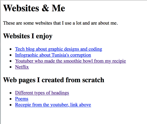 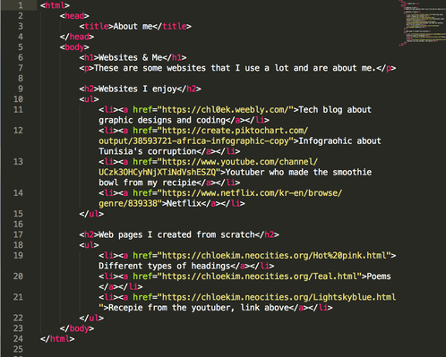
0 Comments
In this lesson we had to create a recipe by using the ordered and unordered list tags. The ordered tags look like this: <ol></ol>, and an unordered list tag looks like thisL <ul></ul>. To choose which phrases to be listed, you have to put the <li></li> tags. If you don't pout the <li></li> tag in, that phrase wouldn't be listed. Here is a recipe made using the list tags. 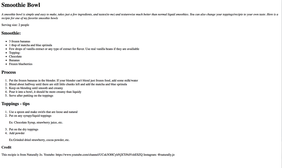 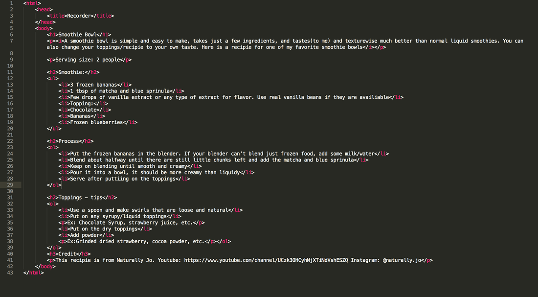 In this mission, we had to learn how to use bold, italics, line break, and horizontal rule tag by writing poems. Bold and italics are the same as the ones you know in google docs/word. Line break is used when you want the phrase to be on a different line without ending the paragraph. And a horizontal rule tag makes a line that goes across the whole webpage and is used to separate sections. Here is the code that I wrote using these four elements. 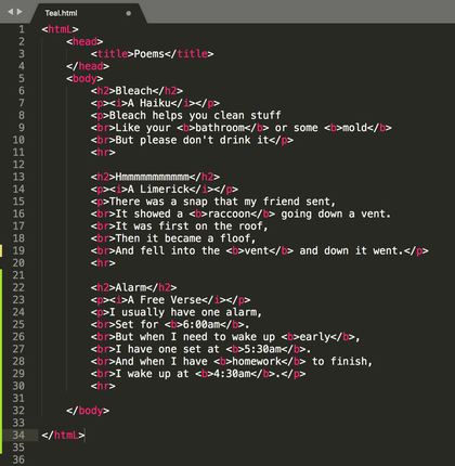 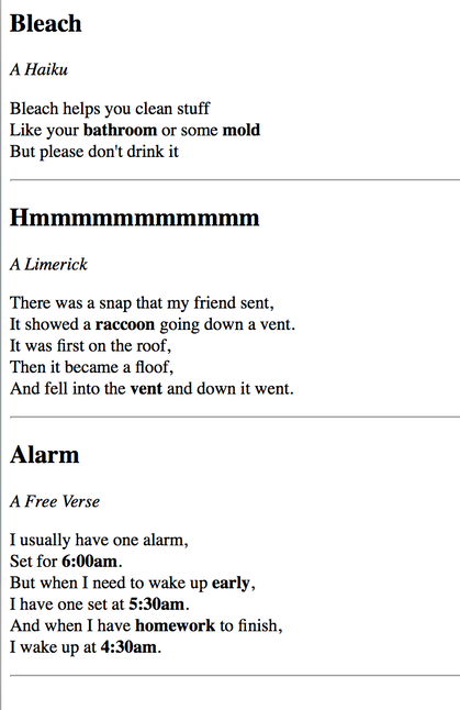 In this lesson, we had to use html codes to make a basic webpage. To do this, I learned about the types of html tags and when/how to use them. For all the tags, you need to use <____>to start and use </_____> to end. For example, if you want a heading, you would put this: <h1>Heading</h1>. After learning about the tags, I had to use them to create a simple webpage(only text) made out of scratch by using Sublime Text. Here is the finished webpage. 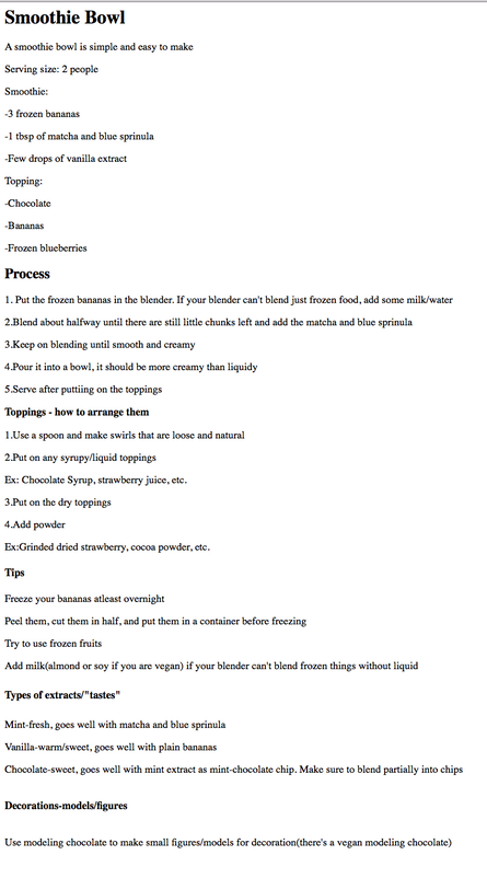 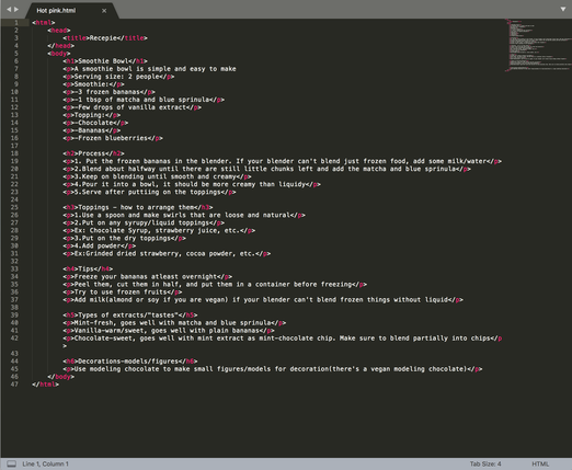 In this step, we had to create nine variations of the 3 logos that we chose(3 per each logo). To do this, I changed the design of the cups, color, and fonts. While I was doing this, it was hard to make the handles of the cups completely smooth without any sharp turns. My favorite part was when I was making the tiny tea leaves for the "i". The gradation process was satisfying especially when I was moving the starting point of the gradation. While I was making this, I was able to realize how probably most of the common logos today had to go through the same steps and was the result of multiple changes. 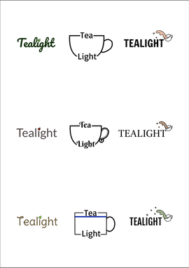 My brand is called "Tealight" and I chose to make a logo for this because I drink tea a lot. Tealight is a brand where it sells multiple types of tea(Ex. oolong, matcha/green, white, puree, etc.) with other tools for making tea. It helps people who also enjoy drinking tea be able to make better "fancier" versions for themselves at home. The teacup's content's color(in the logo) shows how there are also other types of teas that aren't the standard brown or green we think there are. This logo was my favorite because the found was easy to read/see and the teacup was iconic compared to the other two types. Also, in this logo, the tea's opacity is not at 100%, so if you look closely, you can see the cup itself similar to how real tea is transparent. 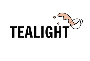 For this assignment, we had to create logos for yourself or a brand that you created. I created a tea brand called Tealight(similar to delight). So that I can start designing the logos, I brainstormed some words that might represent the brand. To do this, I listed some types of teas and other items the site might sell, some unique things about it, and other things that are related to it. My first logo is a slogan that many people use about drama(Tea Spill) with actual tea spilling; this was my brand name before I changed it to Tealight. The second is Tealight with a tea leaf on the 'i'. And finally, the last one is a teacup with tea on the rim and light on the base. I liked both of the Tealight logos, and for the teaspill logo, I like the teacup with the tea spilling out of it. Overall, the process wasn't that hard, but it was hard to come up with a name that wasn't that boring. Here is the picture of my brainstorm work. 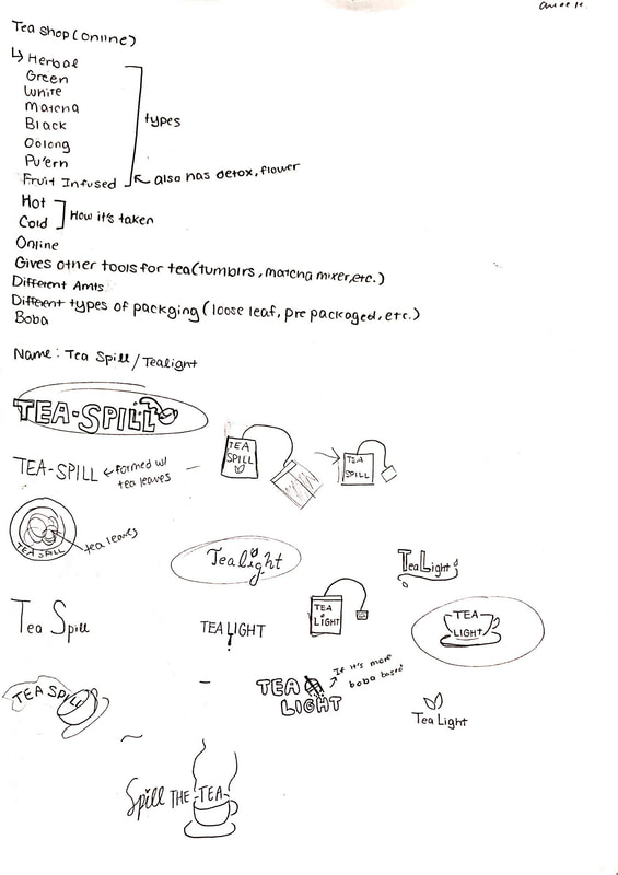 In this assignment, we had to look and create palettes for the 4 color schemes: -Monochromatic: one hue with various saturations and brightness levels -Analogous: hues that are next to each other on the color wheel -Complementary: combines hues from opposite sides of the color wheel -Triad: combines 3 hues evenly spaced around on the color wheel We chose our colors for these schemes by using Adobe Color. My favorite out of these 4 color schemes is analogous since you can easily change and see multiple color choices. For example, you can make different colors in the category of blue colors, or make a combination of multiple different colors(Ex. rainbow). To make the project below, I used a pen tool to make the clouds and raindrops. This was the hardest part because I had to make the cloud shape naturals and make sure that the smaller bumps don't look too combined. The rest of the process was easy since I just had to change the colors of the raindrops by using the HEX codes. For final details, I copied and pasted the clouds and changed their sizes and colors. Here is the project below. 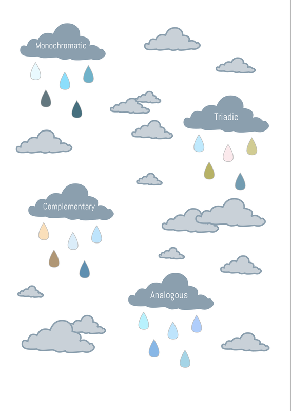 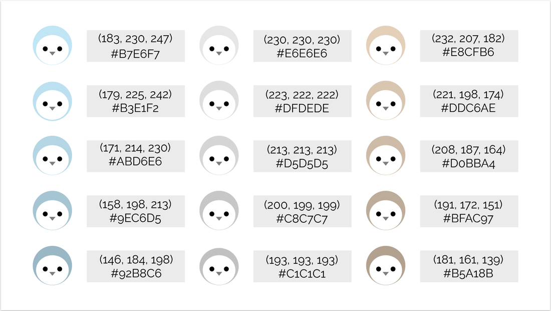 In this assignment, we had to create a simple artwork and make 15 copies of it with different colors. First, I made a penguin by using simple shapes(circles and a triangle). To make it, I overlapped two circles(one was bigger than the other) and made sure that they were centered by using the align center tool. Then I added the eyes by making two black circles and added a gray triangle for its mouth. After I made 15 copies of the penguins, I changed its feather colors to 15 different shades. As you can see above, I chose blue, gray, and tan and made the values get darker. Then I made the boxes for the text and put the text boxes over them. Finally, I found the RGB values and the HEX code for each color and typed them down in the boxes. While I was making this, making the alignment for the gray boxes was hard because the penguins were circles. So I had to make two smaller boxes(identical in size) and put them on each side of the boxes and see if the ends didn't go over the penguin's guides. This worked out well and the final result looked organized and aligned.
What is typography?Typography is a composition and expression such as typeface and letter arrangement of type in design. It includes contrast, repetition, alignment, and proximity. Typography is important because it can change how the person takes a message and how easy it is for them to read. There are 5 main types of fonts, serif, sans serif, monospaced, script/handwritten, and novelty. Serif fonts have feet/hands on them, sans serif are like serif fonts but they lack the feet/hands, monospaced's letters have equal width, script/handwritten looks like they were written by someone, and novelty are fonts that have "special effects". This is where the phrase "Each font has personality and a purpose" comes in. For example, handwritten fonts would feel for old/handmade and would not be suitable for business logos(You would probably use Serif or Sans Serif). Below are two examples of typography. Typeface comparisonIn this project we had to find a font for each 5 types of font(Serif, Sans Serif, Monospaced, Handwritten/Script, and Novelty). To do this we went on Gravit to find fonts for each type that were from the system. The we used the C.R.A.P. design principals to create the project below. 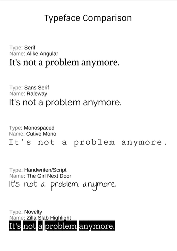 Word portraitsFor word portraits, we had to choose 10 fonts and write two words for each font, one that matches the font and the other that doesn't. For example, I wrote Earl Gray for the font that matches and Lego for the one that doesn't for a handwritten font. When we chose all the fonts and words we used the C.R.A.P. design principals to finish the project. 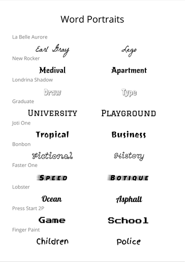 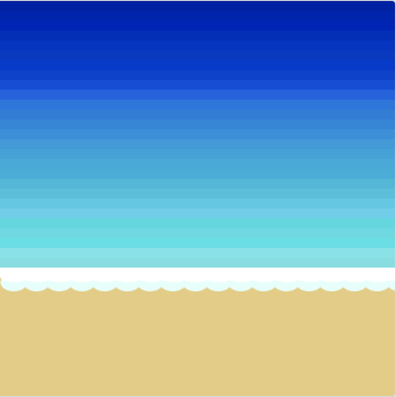 In this lesson, we used a Khan Academy Java Script lesson to learn how to make simple shapes, how to color, and adjust the borders of shapes and backgrounds using Java Script. A few examples of simple shapes that we learned to make are ellipse, rectangle, triangle, arcs, and much more. To make the artwork above, which is a beach, I had to create the ocean itself, the foam made by the waves, and the sand. First, I changed the background to the color of the sand for the base. Then I made multiple rectangles that transitioned from navy blue to a lighter greenish blue for the ocean. Finally, I added two rows of arcs(one in white and other in baby blue) to represent the sea foam. Below is the code I used to create this image. The code:
noStroke(); background(230, 204, 124); // sand fill(0, 22, 168); rect(0,0,400,10); //OCEAN 1 fill(2, 26, 179); rect(0,10,400,10); //OCEAN 2 fill(0, 25, 189); rect(0,20,400,10); //OCEAN 1 fill(0, 38, 189); rect(0,30,400,10); //OCEAN 1 fill(0, 46, 199); rect(0,40,400,10); //OCEAN 1 fill(0, 50, 199); rect(0,50,400,10); //OCEAN 1 fill(0, 50, 209); rect(0,60,400,10); //OCEAN 1 fill(0, 59, 209); rect(0,70,400,10); //OCEAN 1 fill(0, 73, 219); rect(0,80,400,10); //OCEAN 1 fill(9, 96, 227); rect(0,90,400,10); //OCEAN 1 fill(0, 116, 224); rect(0,100,400,10); //OCEAN 1 fill(0, 125, 219); rect(0,110,400,10); //OCEAN 1 fill(0, 133, 219); rect(0,120,400,10); //OCEAN 1 fill(0, 144, 222); rect(0,130,400,10); //OCEAN 1 fill(7, 155, 219); rect(0,140,400,10); //OCEAN 1 fill(0, 163, 219); rect(0,150,400,10); //OCEAN 1 fill(0, 170, 219); rect(0,160,400,10); //OCEAN 1 fill(0, 173, 219); rect(0,170,400,10); //OCEAN 1 fill(26, 185, 217); rect(0,180,400,10); //OCEAN 1 fill(42, 192, 222); rect(0,190,400,10); //OCEAN 1 fill(55, 201, 230); rect(0,200,400,10); //OCEAN 1 fill(76, 208, 235); rect(0,210,400,10); //OCEAN 1 fill(27, 217, 224); rect(0,220,400,10); //OCEAN 1 fill(63, 219, 227); rect(0,230,400,10); //OCEAN 1 fill(41, 224, 230); rect(0,240,400,10); //OCEAN 1 fill(106, 228, 232); rect(0,250,400,10); //OCEAN 1 fill(107, 223, 227); rect(0,260,400,10); //OCEAN 1 fill(255, 255, 255); rect(0,270,400,10); //OCEAN 1 arc(14,279,27,18, -8,194); arc(37,279,27,18, -8,194); arc(60,279,27,18, -8,194); arc(83,279,27,18, -8,194); arc(106,279,27,18, -8,194); arc(129,279,27,18, -8,194); arc(152,279,27,18, -8,194); arc(175,279,27,18, -8,194); arc(198,279,27,18, -8,194); arc(221,279,27,18, -8,194); arc(244,279,27,18, -8,194); arc(267,279,27,18, -8,194); arc(290,279,27,18, -8,194); arc(313,279,27,18, -8,194); arc(336,279,27,18, -8,194); arc(359,279,27,18, -8,194); arc(382,279,27,18, -8,194); arc(405,279,27,18, -8,194); fill(227, 255, 250); arc(14,285,27,18, -8,194); arc(37,285,27,18, -8,194); arc(60,285,27,18, -8,194); arc(83,285,27,18, -8,194); arc(106,285,27,18, -8,194); arc(129,285,27,18, -8,194); arc(152,285,27,18, -8,194); arc(175,285,27,18, -8,194); arc(198,285,27,18, -8,194); arc(221,285,27,18, -8,194); arc(244,285,27,18, -8,194); arc(267,285,27,18, -8,194); arc(290,285,27,18, -8,194); arc(313,285,27,18, -8,194); arc(336,285,27,18, -8,194); arc(359,285,27,18, -8,194); arc(382,285,27,18, -8,194); arc(405,285,27,18, -8,194); |
Archives
April 2019
Categories
All
 This work is licensed under a Creative Commons Attribution-NonCommercial-NoDerivatives 4.0 International License. |
